Color Sieve -- a selective color photo effect app for the iPhone
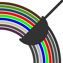
Add an extra touch of drama to your photos! Color Sieve automatically retains the most saturated (pure) colors in an image and converts less saturated (muted) colors to shades of gray. The result is especially striking for scenes in which there are a few brightly colored areas against a muted background.
Using the app is simple -- just load a photo from your album, or snap one with the camera. The effect is automatically applied and shown on the screen. Just tap "save" to store the processed image to your photo album at full resolution.
The slide show below presents a few examples of the eye-catching effects that you can create.
Now available on the App Store! Or try the free lite version (no image save).
Version 1.1 just released! Adds a "tap-to-select" feature. In this mode, tapping on the preview image selects the color tapped for retention.
Tips for Using Color Sieve
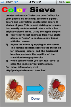
Tapping the "help" button on the main screen displays the basic instructions shown. Here we provide some additional details about how to use the effect adjustments (which are controlled by tapping on the image) .
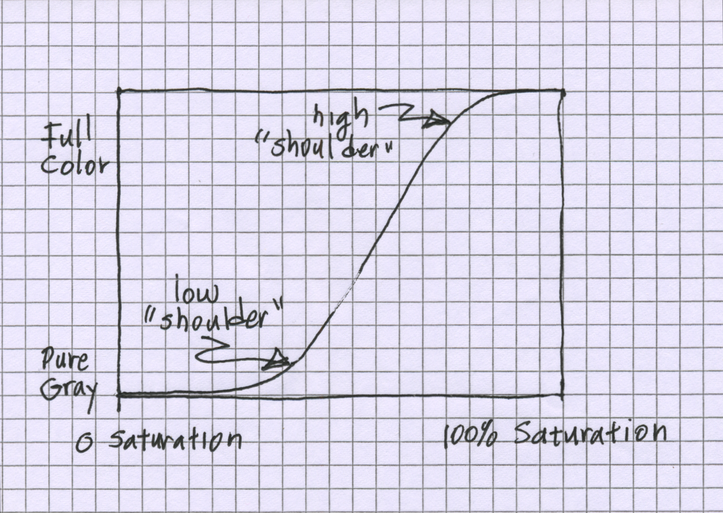
In order to better understand the controls, it may help to outline Color Sieve's color adjustment algorithm. For each pixel in the original image, a saturation value is computed and used to determine the mixture between gray and full color in the corresponding result pixel. Tapping on a screen location adjusts the "S" shaped curve that is used to convert saturation values into mixture values (color vs. gray percentage). This curve is shown schematically below. The vertical tap location corresponds to the position of the low shoulder of this curve. Horizontal tap location sets how close the high shoulder is to the low shoulder (and therefore the steepness of the rising portion of the curve).
Tapping near the left side makes the curve rise quickly, so that most saturation levels are mapped either to pure color or full gray, with few intermediate values. Taps near the right side produce a more gently rising curve, so that there are more intermediate gray-color mixtures.
Tapping closer to the top of the screen moves the low shoulder to the right, so that only the most saturated pixels retain their color. Taps near the bottom move the low shoulder to the left, so that less saturated pixels retain more color.
This is really simpler than it sounds!
The effects of changing this curve show up immediately in the on-screen image, so it is easy to gain intuition by experimenting. If you are confused by this technical description, don't be afraid to experiment! The simple rule is: tap bottom right for full color, top left for monochrome and in-between taps have in-between effects.
The Double Tap Trick
A two-finger tap flips this curve around, so that unsaturated pixels retain their original colors, and saturated colors are converted to gray. Of course, since in this case since the retained colors are not bright to start with, the effect is to produce a generally muted appearance. Note that a second two-finger tap will switch back to the normal curve.
Tap-to-Select
Version 1.1 introduces a new feature that allows you to select the hue that will be retained by tapping on that hue in the preview image. To enable tap-to-select, swipe a finger across the screen from left to right. A dialog box will pop up to confirm your selection. Tap "OK" an you are ready to go. To go back to the "auto-select" mode (where the brightest hues are automatically retain) just swipe in the opposite direction (from right to left).
We illustrate how this works with an example image, shown to the left with its original colors.
We illustrate how this works with an example image, shown to the left with its original colors.

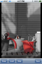
If we enter "tap-to-select" mode, and tap on the blue bucket on the lower left, this is the result. The blue color in the bucket (and similar hues in one of the shovels and the yellow bottle's label) are retained, and everything else is gray.
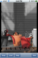
Likewise, tapping on the red bucket has the effect shown here. Notice that the orange flower pot also retained its color, because this hue is similar to red. It is possible to adjust how restrictive the hue select is by swiping vertically. Swiping upwards incrementally increases the color selectivity, and swiping downwards incrementally decreases selectivity.
For instance, if we tap on the red bucket then swipe upwards several times we can increase the selectivity so that the orange pot fades to gray. Note that the hue and selectivity settings persist, so that if we were to load an new image the same settings would be applied.
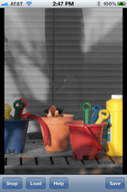
Finally, contrast these results with the result of the original "auto-select" mode, shown here. Note that all of the bright hues -- red, green, blue, yellow and orange -- are retain, and the more muted hues are converted to gray.